CMS
All modules
Manage site menus
CMS · 7 of 17 · 5 min read
Menus are the lists of links visitors use to move around the site, for example the navigation bar at the top or the links in the footer. From here you create the items, order them, organize them into sub-items, and choose where each link points and who sees it.
The menu list
The list shows all the menus on the site. For each menu you see the name, the location and the number of items.
In the demo organization there are two menus: Main menu, in the Header location with 5 items, and Footer menu, in the Footer location with 3 items.
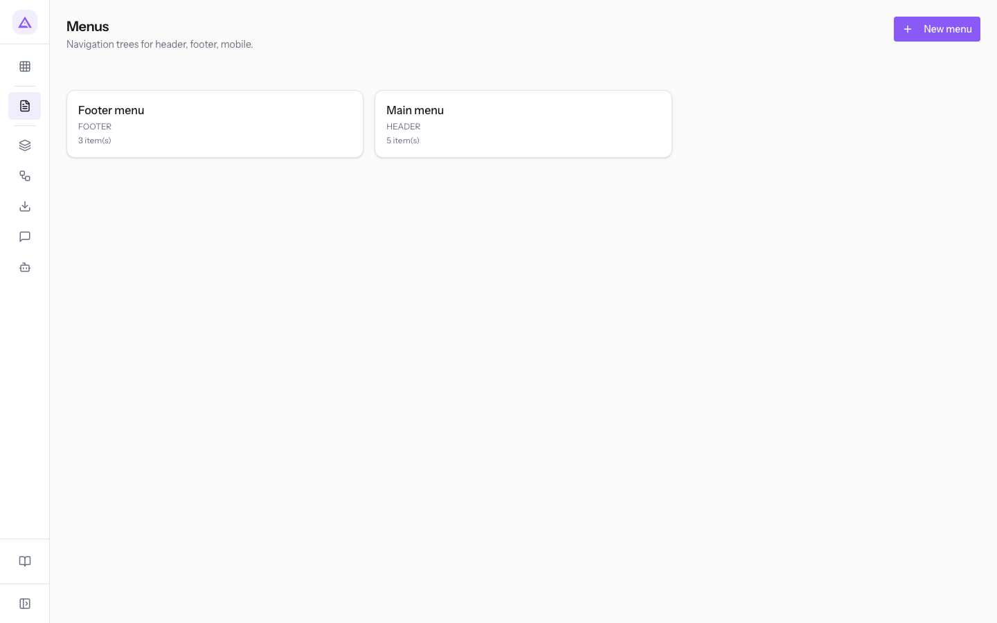
To open a menu, press its card in the list. The menu editor opens.
Setting the menu name and location
At the top of the editor are the menu's general details. The location indicates in which part of the site the menu appears.
- Open the menu from the list, for example
Main menu. - Fill in the menu fields.
- Press Save & exit.
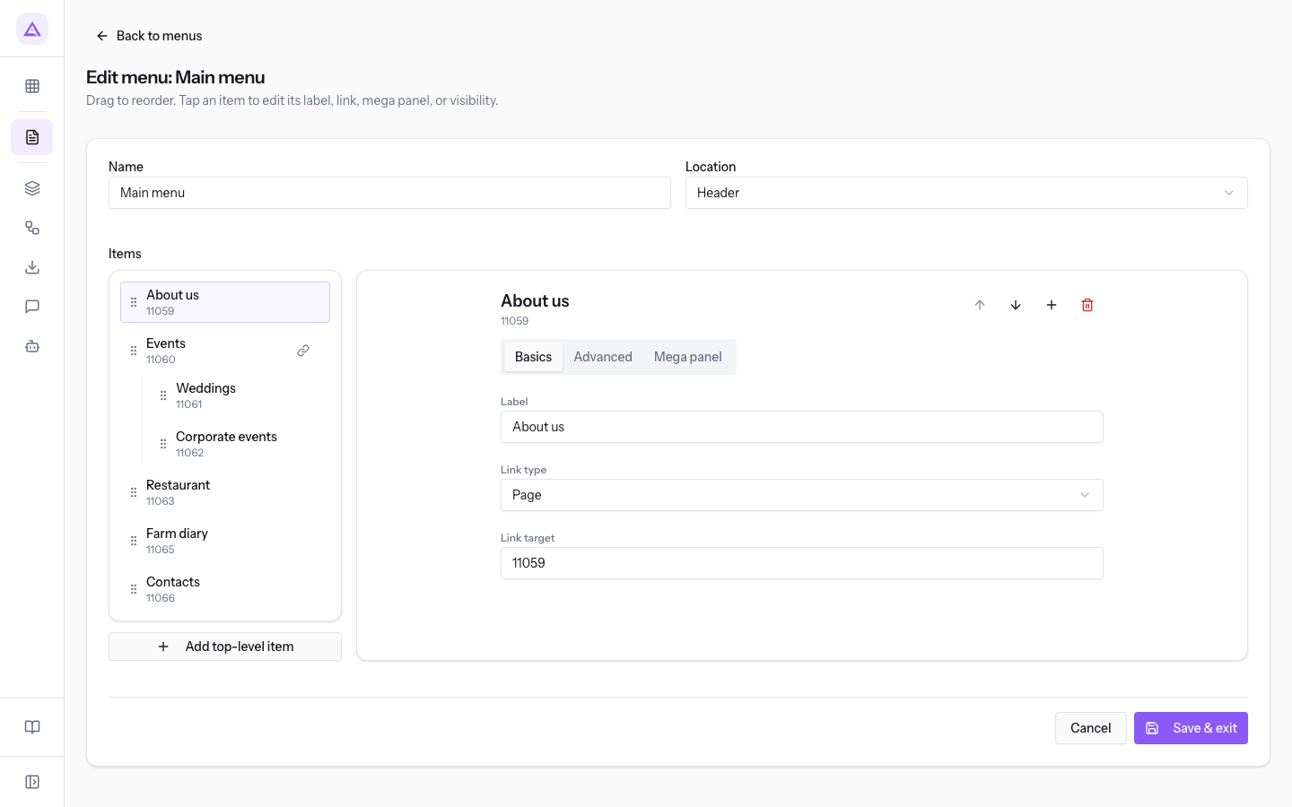
- Name: the name of the menu.
- Location: the part of the site where the menu appears.
- Header: the bar at the top.
- Footer: the footer.
- Mobile: the navigation on smartphones.
- Sidebar: the side bar.
With Cancel you exit without saving. With Back to menus you return to the list.
Tip: if you want different links at the top and in the footer, use two menus with different locations, as
Main menuandFooter menuin the demo.
Adding and organizing items
The Items section shows the tree of the menu's items, in the order they appear on the site. An item can have sub-items: in the demo, Weddings and Corporate events are sub-items of Events.
Use a top-level item for a section of the site. Use a sub-item for a page that belongs to that section.
To add a top-level item:
- Press Add top-level item.
- The new item appears at the bottom of the tree, with a link of type External / path and address
/. - Fill in the item's tabs, described below.
- Press Save & exit.
To add a sub-item:
- Press the parent item in the tree, for example
Events. - Press Add child item.
- The new item appears under the parent item. Fill in the Basics and Advanced tabs.
- Press Save & exit.
Note: a sub-item does not have the Mega panel tab. The mega panel is configured only on top-level items.
To change the order of the items, drag them in the tree, or select an item and use Move up and Move down. To remove an item from the menu, select it and press Delete.
Note: the child pages of a page can appear on their own in the menu, after the items added by hand, when the item has automatic expansion of children. This way a new page under
Eventsenters the menu without editing the menu. To create child pages, see Organizing the site pages.
Basics tab: item text and link
The Basics tab defines the text the visitor sees and the link destination.
- Press the item in the tree, for example
About us. - In the Basics tab, fill in the fields.
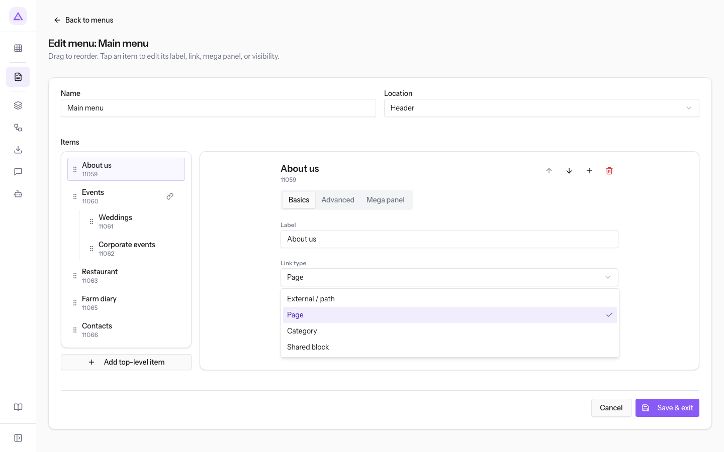
- Label: the text of the item in the menu.
- Link type: the type of destination of the item.
- External / path: a manually written address. You can enter a site path or an external address in the Link target field, as the hint
/about or https://…suggests. - Page: a page of the site, specified in the Link target field (hint
ID or slug). - Category: a content category, specified in the Link target field. See Create content categories.
- Shared block: a shared block, specified in the Link target field. See Using shared blocks, the header, and the footer.
- External / path: a manually written address. You can enter a site path or an external address in the Link target field, as the hint
Choose Page or Category when the link leads to content on the site. Choose External / path for an external site or for an address that does not match a page.
Advanced tab: opening and visibility
The Advanced tab sets how the link opens and who sees the item.
- Select the item in the tree.
- Open the Advanced tab.
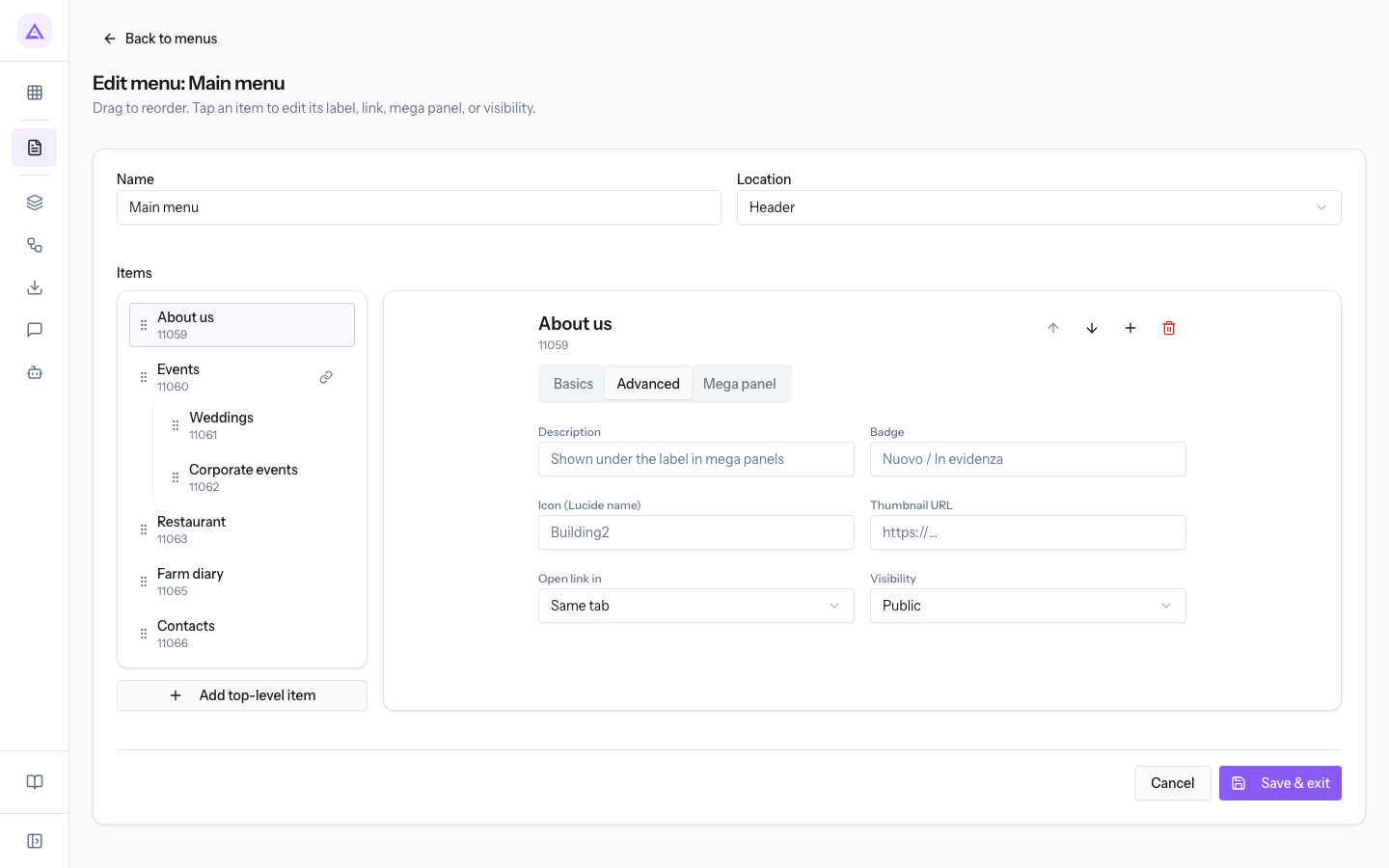
- Description: the text that appears under the item's label in the mega panels. The field suggests
Shown under the label in mega panels. - Open link in: where the destination page opens.
- Same tab: the default value.
- New tab: suitable for links to external sites.
- Visibility: who sees the item in the menu.
- Public: all visitors. This is the default value.
- Members only
- Staff only
Mega panel tab
A mega panel is a multi-column panel that opens from a top-level item. Use it when a section has many links to group. For short menus, sub-items are enough.
- Select a top-level item in the tree.
- Open the Mega panel tab.
- Turn on Has mega panel. The columns and the Featured card section appear.
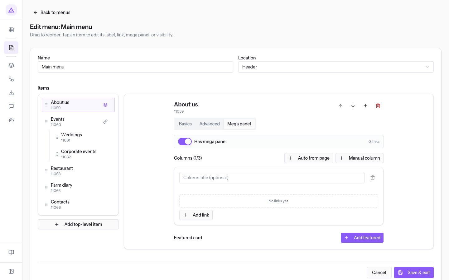
- Has mega panel: turns on the mega panel for the item. It is off by default.
- Columns (1/3): the columns of the panel. The counter shows how many columns there are compared to the maximum.
- Column title (optional): the title of the column.
- Auto from page and Manual column: how the column is filled.
- Add link: adds a link to the column.
- Remove column: removes the column from the panel.
At the end, press Save & exit.
See it on your company, not on a slide deck.
In 30 minutes we map the software you use today.We show you how much work and how much margin Archimedes gives back.
Show me on my business →What industry are you in?
One tap — it lets us prepare the demo around your world.
What tools do you use today?
Pick the ones you recognise — or just type them. It helps us show you how they migrate.
Last step: your details.
We reply within one working day — and right after, if you like, you pick the demo slot yourself.
We couldn't send your request. Try again, or write to us at [email protected].
By sending, you agree to your data being processed so we can get back to you about the demo. Privacy notice.
Preview form — nothing is sent from this page.
Want to schedule the demo now?
Your call: book the slot you prefer yourself, or we'll call you to arrange it.
Live availability, 30 minutes, instant confirmation. The calendar opens in a new tab.
Lock in your slot ↗We'll get back to you within one working day — and we'll join the call already knowing your world.
The calendar is open in another tab: pick a slot and the demo is booked. Can't see it? Reopen it ↗
Preview page: nothing was sent.
Our calendar is live: take the slot that suits you and the demo is booked. 30 minutes, instant confirmation, no waiting.
Lock in your slot ↗